I’ll provide you with tips and information on how to avoid them so you don’t fall for these interior design mistakes and won’t regret them later.
Leave a comment below and tell me which of these blunders you’ve made or are currently making at home.
No matter which one or how many they are, remember that we all make mistakes. The most important thing is to get them fixed.
Let’s Fix Them…
Living Room Mistakes To Avoid
1. Artwork That Is Hung Too High Or Too Low
People have a habit of hanging art higher up on the wall than it should be. Our work should be hung at eye level for people to naturally appreciate the piece of art.
Maintain the visual order of the following diagrams and basic rules.
Tip #1
Once you’ve decided on the height of your artwork, stick to it to create flow in your space.

Tip #2
Align the pieces at their center points.

Tip #3
Mix shapes, sizes, and orientations for a more relaxed style.

Tip #4
Organized gallery wall.
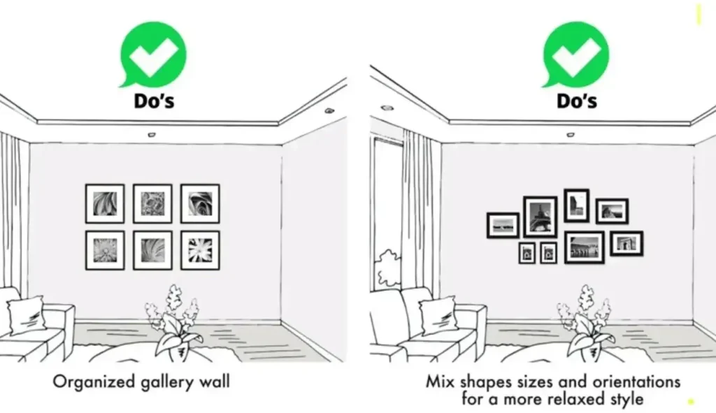
The easiest way to ensure that there are no errors or unsightly gaps is to draw and cut out the frame outline on paper.

Then tape the cutouts to your wall and experiment with various positioning choices until you achieve the desired result.
RELATED: 15 Must-Have Things In Your Living Room
2. Not Using Ceiling-Height Curtains
What’s the most common mistake people make when it comes to window treatments? Accent with tall windows and high curtains.
Just using one light source is insufficient because it does not aid in the creation of contrast, fixed curves, or vibrant colors.
The floor-length curtains draw the eyes upward along the entire length of the accordance, creating an illusion of height and spaciousness.
Tip #5
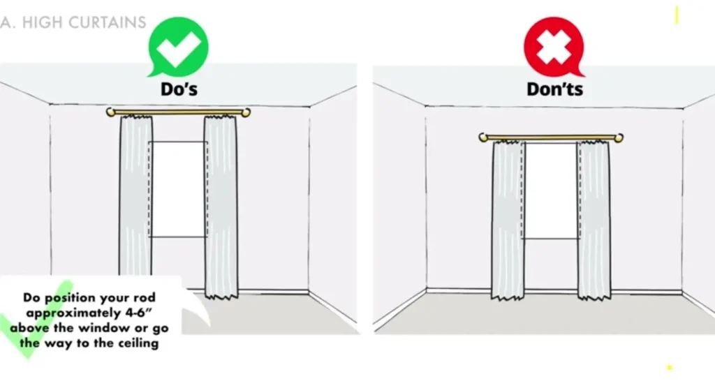
Place your rod about 4-6″ above the window or the ceiling.

Ensure the rod is wide enough so that when the curtains are open, the edges cover the windows firmly but not the glass.

Stacking the curtains next to the window instead of covering it will help the window appear larger.
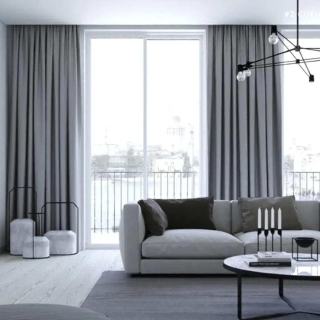
For an elegant look, curtain panels should be wide enough that, there’s fullness to them even when they are closed.
To achieve that, the width of the panels looks full and elegant. The width of the curtain should be three times wider than the window.
3. Using The Wrong Shape And Size Of Rug
Rugs are necessary for identifying spaces and establishing boundaries for your furniture. You must make sure the rug is the appropriate size.
You should purchase one that is appropriate for your room. You must remember the size and spacing of the furniture in the room when selecting the appropriate rug size.
It’s important to make sure that all the furniture fits on at least the front legs of the person sitting in the room.

Let’s see some layouts and some DOs & DON’Ts on how to choose rug size and placement.
#Rug Placement Layout For Living Room

#Rug Placement Layout For Dining Room

4. Exposed Cables
All details count in the interior design. Another common mistake that affects perception and order in space is having a visible cable that runs through walls and other surfaces.
These cables and wires must be hidden, especially those of the TV lamps or other electrical features.
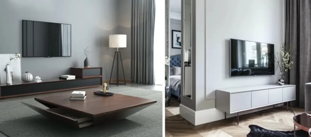
If you can’t hide the TV cables inside a wall, choose to use a power cord hider. It’s very easy to install, and you’ll have a better appearance instantly.

5. Having One Light Source
Lightning is key in interior design, an aspect that people often forget. Having a single light source in each room may allow you to see in the dark, but it’s not doing any good.
Just using one light source is insufficient because it does not aid in creating contrast, fixed curves, or vibrant colors.
#Single Light Source
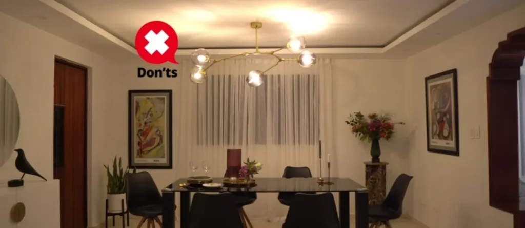
#Layered Lighting

Fix this mistake by adding different lighting sources. Layered lighting sources, such as ambient lighting for overall illumination through the table, wall, and floor lamps, are required in this space.
Ceiling light truck lights or wall-mounted lights add task lighting for a specific task or operation, such as reading, writing, or eating, through the sixth spot ceiling light.
Accent lights highlight a specific item or area and draw attention to the feature through the sixth spot.
Truck lights or wall-mounted lights add task lighting for a specific task or activity, such as reading, writing, or eating.
A good lighting plan for interior home decoration will combine all three at different heights.
6. Not Measuring The Space
Choosing furniture and decor items without first weighing the room. Not planning space usage is a common interior design mistake that people make.
Don’t rely on your eyes to measure a space before purchasing furniture or decorative accents.
Measure all the dimensions to map out your space to avoid overcrowding on furniture. Think about a space for circulation; you need to measure the heights available.
Measure your walls to select artwork in proportion to the area, and so on.
7. Designing Without Considering Your Style And Needs
One of the biggest mistakes when designing a space is that people don’t stop to think and ask themselves what they want and need.
Instead of following patterns, utilize concepts that are similar to your own.
First, ask yourself what you admire about the rooms and what you like about those inspirations—the colors, the texture, the materials, the lighting, and the furniture.
You can begin your interior home decoration with confidence once you’ve established your personal preferences.
Keep in mind that good architecture is about more than just aesthetics. You should live in your space and identify how your family uses it before you remodel it.
It is a great way to learn about the details you want to include in your interior design plans.

