In interior design, the Japandi style has been making waves, drawing inspiration from the minimalism of Japanese design and the coziness of Scandinavian aesthetics.
This unique fusion creates a harmonious blend of Japanese minimalism and Scandinavian coziness, resulting in calming and inviting spaces.
At the heart of Japandi design is a carefully curated color palette that reflects the principles of Wabi-sabi and Hygge, celebrating imperfections, simplicity, and a connection to nature.
Understanding Japandi Interior Design Style
Japandi, a term derived from combining “Japan” and “Scandi,” is more than just a design trend; it’s a philosophy that transforms living spaces into serene sanctuaries.
At its core, Japandi style merges the Wabi-sabi principles of finding beauty in imperfections with the Hygge concept of creating a cozy and contented atmosphere.
This combination results in a space that feels minimalist yet warm, timeless yet inviting.
The appeal of Japandi lies in its ability to strike a balance between Japanese and Scandinavian design philosophies.
Japanese minimalism emphasizes simplicity, functionality, and the celebration of natural materials. On the other hand, Scandinavian cozy, represented by the concept of hygge, introduces warmth, comfort, and a sense of togetherness.
When these elements are harmoniously blended, they create a unique design style that fosters tranquility and well-being.
As we delve into the philosophy of Japandi design, discover how you can enhance your home interior further by incorporating the timeless aspects of Wabi Sabi.
Explore the ‘Best 10 Ways To Add The Wabi Sabi Design To Your Home Interior‘ for a truly harmonious and authentic living space.
The Philosophy Behind Japandi
To truly appreciate the Japandi style, one must delve into the underlying philosophy that guides its principles.
Embracing imperfections and simplicity is a fundamental aspect of Japandi.
In a world often dominated by sleek and flawless designs, Japandi encourages us to find beauty in the irregularities, creating a more authentic and lived-in feel to our spaces.
Central to Japandi is the concept of connecting with nature and finding balance. This is reflected not only in the choice of materials but also in the color palette.
The color scheme used in Japandi design is carefully selected to mimic the natural world, incorporating soft neutrals, earthy tones, and muted greens.
The aim is to bring the calming essence of nature indoors, creating an environment that promotes relaxation and well-being.
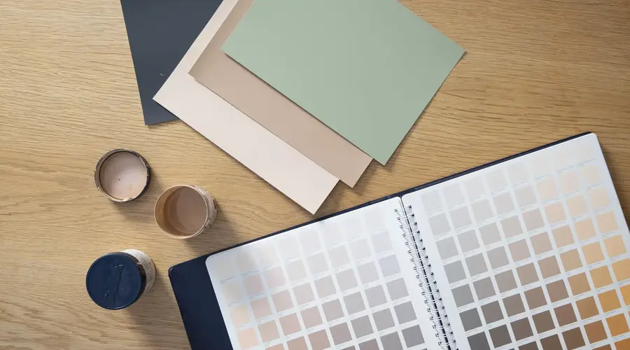
Exploring The Japandi Color Palette
Now that we’ve grasped the essence of Japandi philosophy, let’s delve into the specific colors that define this captivating design style.
The Japandi color palette revolves around creating a serene and grounding ambiance within your living spaces. Here’s a breakdown of the key elements:
Soft Neutrals as the Foundation
At the core of Japandi design are soft neutrals that set the foundation for a calming atmosphere. Think of shades like muted grays, soft whites, and warm beiges.
These colors form a versatile backdrop, allowing other design elements to shine while creating a sense of openness and airiness.
WHITES

- Ivory White: Warm and inviting, perfect for soft furnishings to add a touch of elegance and create a cozy atmosphere.
- Cream White: Subtle and versatile, ideal for walls or larger furniture pieces, creating a serene backdrop for Japandi interiors.
- Pearl White: Delicate and refined, use it for accents like vases or cushions to infuse a gentle sophistication into the space.
GRAYS

- Light Gray: A modern neutral, great for furniture and decor items, providing a sleek contrast and maintaining a calm ambiance.
- Dove Gray: Elegant and timeless, used on larger surfaces like walls or curtains for a sophisticated, muted backdrop.
- Charcoal Gray: Bold and dramatic, perfect for statement pieces or accent walls, adding depth and a contemporary edge to the space.
BEIGES
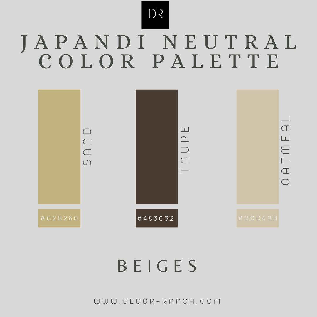
- Sand: Warm and neutral, suitable for flooring or larger furniture, evoking a sense of natural tranquility in Japandi interiors.
- Taupe: Versatile and soothing; use on furnishings for a balanced look, blending seamlessly with the overall calmness.
- Oatmeal: Earthy and comforting, great for textiles and smaller decor items, contributing to the overall warmth and tactile appeal of the space.
Earth Tones for Natural Warmth
Japandi incorporates earthy tones like browns, beiges, and muted greens to infuse a touch of nature. These hues bring a grounding and organic feel to the space, mirroring the natural world.
Picture the warmth of wooden elements and the gentle embrace of nature-inspired colors seamlessly blending into your interiors.
GREENS

- Sage: Calming and versatile, sage greens evoke nature, making them ideal for creating a peaceful ambiance in living spaces or adding freshness to decor accents.
- Moss: Earthy and subdued, moss tones bring a touch of nature indoors, lending a grounded feel to furniture and decor elements.
- Olive: Warm and inviting, olive hues infuse spaces with a cozy atmosphere, making them perfect for textiles and accent pieces.
WARM BROWNS
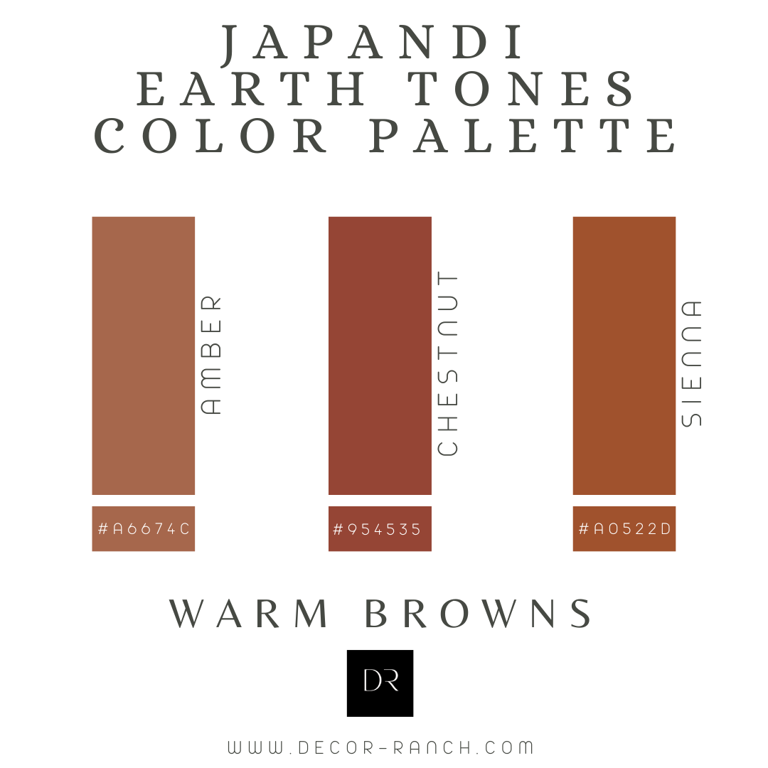
- Amber: Rich and comforting, amber adds a touch of warmth to furnishings and accessories, creating a welcoming and harmonious vibe in any room.
- Chestnut: Deep and earthy, chestnut tones provide a sense of strength and elegance, making them well-suited for statement furniture or accent details.
- Sienna: Rustic and warm, sienna hues bring an earthy charm to interiors, perfect for creating a grounded, nature-inspired palette in Japandi design.
MUTED BLUES
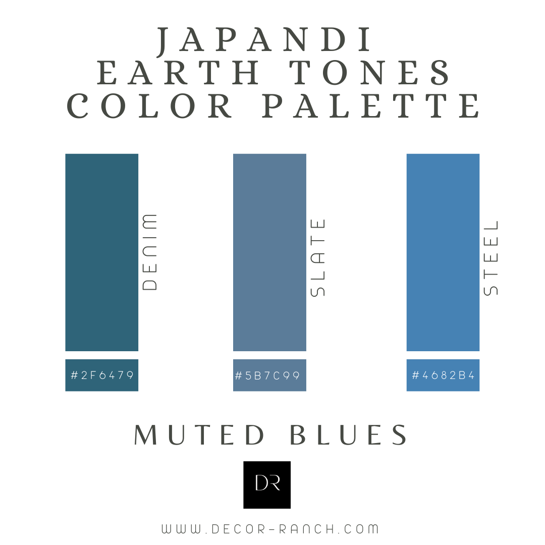
- Denim: Cool and serene, denim blues add a touch of sophistication to decor, whether in textiles or subtle pops of color throughout a Japandi-inspired space.
- Slate Blue: Subdued and versatile, slate blue tones create a serene atmosphere, ideal for accentuating the calm and balanced essence.
- Steel Blue: Cool and modern, steel blue adds a contemporary touch to furnishings and decor, effortlessly blending with the minimalist aesthetics of Japandi design.
SOFT REDS
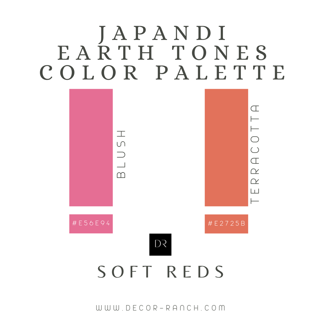
- Blush: Soft and tender, blush tones bring a delicate warmth, perfect for textiles and accessories, infusing a gentle and inviting feel.
- Terracotta: Earthy and grounded, terracotta adds a touch of rustic charm to decor elements, creating a cozy and welcoming ambiance within Japandi-inspired spaces.
Incorporate A Natural Wood Tone for Authenticity
Authenticity is a key principle in Japandi design, and nothing captures it better than warm wood grain. From light oak to deeper walnut tones, incorporating wooden elements adds both visual interest and tactile warmth to the space.
Whether it’s in furniture, flooring, or accents, the use of wood contributes to the timeless and genuine aesthetic of Japandi.
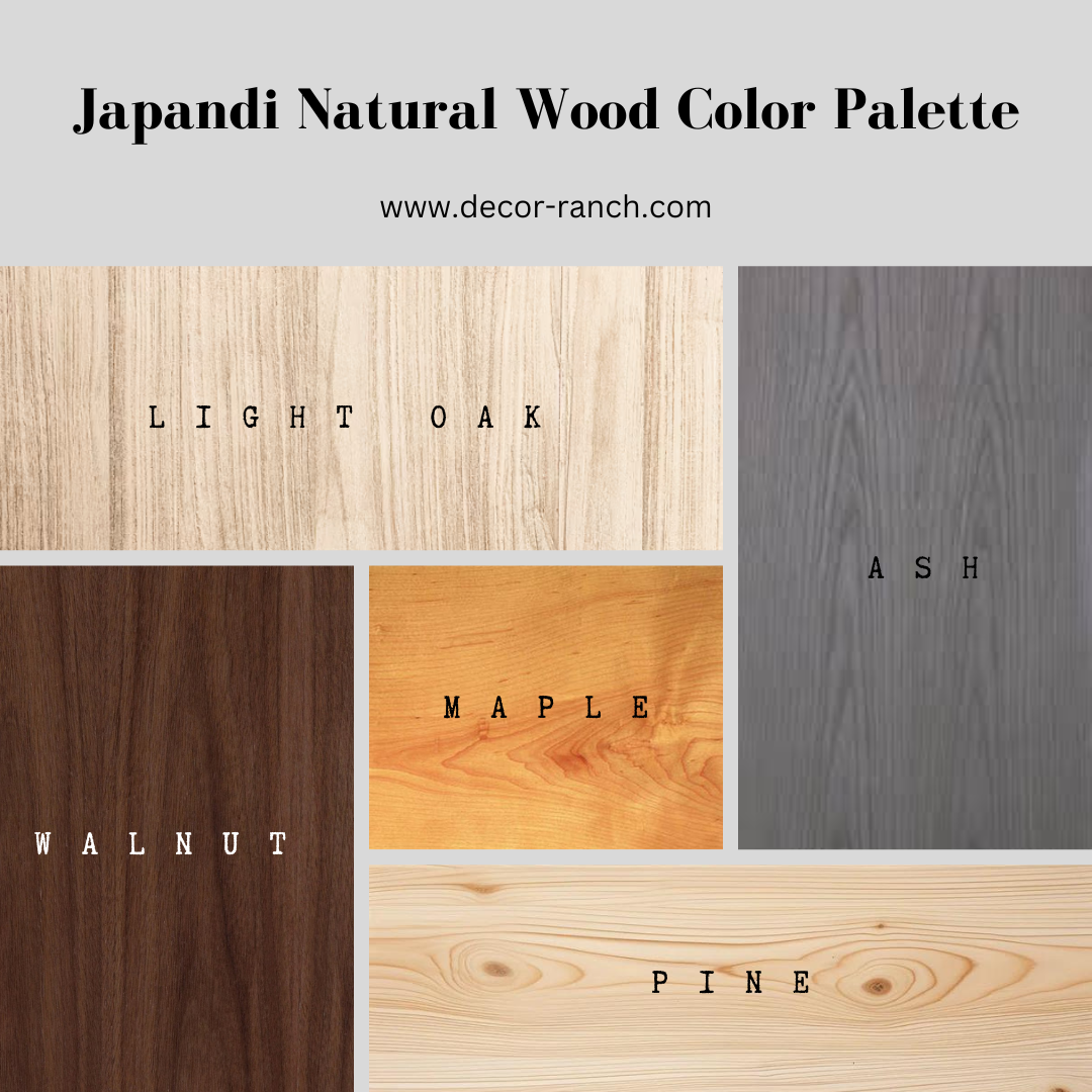
- Light Oak: Warm and inviting, perfect for furniture. Adds a touch of nature to interiors.
- Ash: Modern and versatile, it complements various styles, bringing a sense of calm.
- Pine: Light and airy, great for creating a fresh, Scandinavian vibe in any space.
- Maple: Timeless and classic, its gentle hue enhances a sense of simplicity and elegance.
- Walnut: Rich and sophisticated, ideal for furniture, infusing spaces with a cozy, timeless charm.
Achieving Balance with Accent Dark Contrast
While soft neutrals dominate, Japandi design achieves balance by incorporating dark contrast. This could be in deep charcoal, navy, or black accents.
These darker hues add depth and sophistication to the palette, creating a harmonious balance between light and shadow.
- Matte Black: Adds sophistication, grounding the palette. Ideal for frames and fixtures, it punctuates the space with subtle elegance.
- Onyx: Deep and mysterious, Onyx infuses a touch of drama. Perfect for statement pieces, it elevates the overall aesthetic with its bold presence.
- Charcoal: Versatile and neutral, charcoal bridges dark and light tones. Great for accent walls or furnishings, it effortlessly complements other Japandi colors.
- Deep Indigo: Evokes tranquility and depth. A great choice for textiles or decor, deep indigo introduces a calming richness to the Japandi palette.
- Navy: Classic and timeless, navy anchors the design. Whether in textiles or accent furniture, it adds a sense of stability and enduring style.
For more inspiration on creating a serene Japandi living room, explore our guidepost on [Japandi Living Room Ideas For Serene Simplicity]
Applying Japandi Color Palette to Interiors
Understanding the individual components of the Japandi color palette is essential, but knowing how to apply them to your interiors is where the magic happens.
Let’s explore practical tips for bringing the Japandi color scheme into your living spaces:
Layering Neutral Colors for Depth and Texture
To create visual interest, layering is key. Combine different neutral tones, playing with light and dark shades to add depth and texture.
Picture a light gray sofa against a backdrop of warm beige walls, complemented by darker gray throw pillows. This layering effect adds a subtle complexity to the space.
Choosing Paint Colors for Japandi-Inspired Spaces
When selecting paint colors, opt for those that align with the soft neutrals and earthy tones of Japandi. Consider hues like Supermoon, Moonlight, Cotton Tail, and Ballet White for walls.
These colors provide a versatile canvas for the rest of your decor while maintaining the serene and cozy ambiance intrinsic to Japandi.
Incorporating Green Plants and Natural Materials
Bring the outdoors in by incorporating green plants and natural materials. Not only do plants add a pop of muted green, but they also contribute to a healthier indoor environment.
Combine this with materials like wood, stone, and rattan to enhance the connection to nature within your home.
Using Black Accents to Create a Calming Effect
Black accents may seem bold, but when used thoughtfully, they contribute to the calming effect of Japandi design.
Consider black picture frames, light fixtures, or even a statement piece of furniture.
These accents punctuate the space, adding a touch of sophistication without overwhelming the soothing atmosphere.
Expert Insights on Japandi Color Choices
To truly master the art of Japandi color palettes, it’s valuable to gain insights from experts in the field.
Let’s explore what renowned designers and paint professionals have to say about achieving the perfect blend of Japanese minimalism and Scandinavian cozy.
Maria Killam’s Insights on Neutral Colors and Undertones
Maria Killam, an expert color strategist, emphasizes the importance of neutral colors and undertones in Japandi design.
According to her, selecting the right neutrals is crucial for achieving the desired aesthetic.
Look for undertones that align with the warmth of Japandi, such as subtle beige or gray undertones.
This attention to detail ensures that the colors harmonize seamlessly, creating a cohesive and inviting environment.
Designers’ Recommendations for Japandi Paint Colors
Leading designers often have go-to paint colors that perfectly capture the essence of Japandi. Consider the following recommendations:
- Dunn-Edwards’ Color of the Year: Art & Craft (DET682): This warm, neutral hue with earthy undertones is an excellent choice for walls, setting the stage for a Japandi-inspired space.
- Backdrop Paint’s Minimalist Fall Collection: Inspired by the simplicity of fall, this collection offers nature-inspired hues that align with Japandi principles. Think warm browns, soft greens, and muted grays.
- Nature-Inspired Hues for Hygge with Oatmeals and Natural Woods: Infuse your space with the cozy comfort of Hygge by incorporating oatmeal and natural wood tones. These warm, light colors create an inviting atmosphere that resonates with the Scandinavian element of Japandi.
- Drama with Stark Contrast: Mauves and Browns: For those who appreciate a touch of drama, consider incorporating mauves and deeper browns. These contrasting shades add a layer of sophistication while maintaining the overall calming effect.
Top Japandi Paint Colors
When selecting paint colors for a Japandi-inspired interior, consider the following options:
- Airy Neutrals: Supermoon, Moonlight, Cotton Tail, Ballet White, and Gray Mist are excellent choices for walls, creating a canvas that complements the natural materials and muted tones of Japandi.
- Earth Tones: Embrace the warm and grounding nature of Canyon Dusk and Morris Room Grey for a cohesive color scheme that mirrors the beauty of the earth.
- Dark Contrast: Achieve balance with Tar and Cascade Green, providing a dark contrast that adds depth and sophistication to your Japandi design.
In the upcoming sections, we’ll explore practical tips for designing with the Japandi color palette and how to extend this aesthetic to your lifestyle choices.
Designing with Japandi Color Palette
Now that we’ve established the foundation of the Japandi color palette, let’s dive into practical tips for designing with these harmonious hues.
Whether you’re revamping an entire room or introducing subtle changes, these insights will guide you toward creating a Japandi-inspired sanctuary.
Tips for Designing a Japandi-Inspired Space
- Incorporate Natural Materials and Muted Colors:
- Choose furniture and decor items made from high-quality natural materials like wood, stone, and bamboo.
- Opt for muted colors in upholstery and textiles to maintain a soft and calming atmosphere.
- Create Sanctuary Spaces for Relaxation and Well-Being:
- Designate specific areas for relaxation, such as a cozy reading nook with plush cushions and soft blankets.
- Integrate elements like floor cushions and low coffee tables to enhance the Japanese minimalist feel.
Explore practical tips for designing a Japandi-inspired bedroom in our blog post: Practical Japandi Bedroom Ideas For Ultimate Relaxation.
- Consider Circular Design:
- Embrace circular shapes in furniture and decor, aligning with the Japanese philosophy of continuity and unity.
- Round rugs, circular mirrors, and curved furniture create a sense of flow and balance.
For more in-depth insights on incorporating the Japandi style into your home, check out our guide: Japandi Style: The Ultimate Guide For Your Japandi Home.
Japandi Lifestyle and Color Palette
The allure of Japandi extends beyond interior design, influencing lifestyle choices that promote a calm and serene living environment.
Let’s explore how you can seamlessly integrate the Japandi color palette into various aspects of your life.
Extending the Japandi Color Palette to Lifestyle Choices
- Curate a Calm and Serene Living Environment:
- Choose clothing in soft neutrals and earthy tones to align with the Japandi color palette.
- Opt for bedding and linens in muted colors to create a serene atmosphere in your bedroom.
- Nature-Inspired Living:
- Bring elements of nature into your daily life through potted plants, floral arrangements, and natural textures in clothing and accessories.
- Consider eco-friendly and sustainable products that align with the ethos of Japandi.
- Thoughtful Furniture Design:
- Select furniture pieces that showcase thoughtful design, combining functionality with minimalist aesthetics.
- Look for pieces that echo the warmth of wood and the simplicity of Japanese design.
- Embrace Nature’s Beauty in Design:
- Choose accessories and personal items that reflect the beauty of nature, such as stone or wooden jewelry and ceramic tableware.
- Surround yourself with items that bring a sense of tranquility and connection to the natural world.
By extending the Japandi color palette to your lifestyle choices, you create a holistic and immersive experience that goes beyond aesthetics. Get ready to embark on a journey of serenity and style!