Colors can transform the way we perceive a space. One of their characteristics is that they allow us to modify the appearance and proportion of a space.
We can make a room appear bigger, wider, taller, or deeper -yes, all these by using colors.
It’s important to know where and how to use colors to trick the mind and make our interior look and feel the way we want.
Hello, Everyone…
In this blog post, you’ll learn to talk about Colors & Visual Effects. Stay until the end because I’ll share the professional’s secret of selecting colors.
If you have any queries or anything on your mind, or any idea, then please share with us in the comment section.
Bright vs Dark
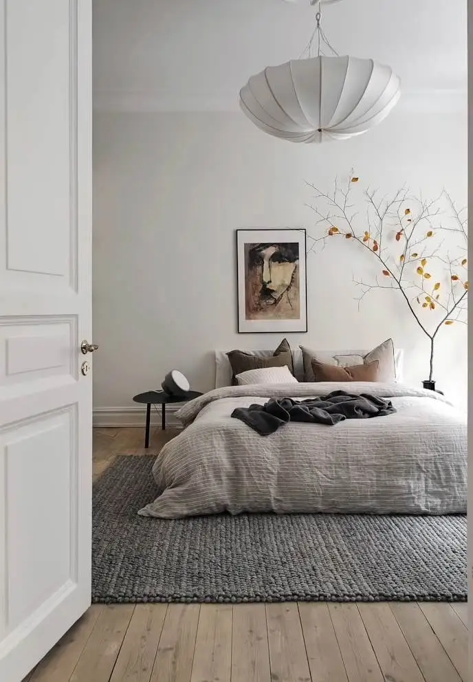
Light Color expands spaces, making them brighter and lighter to widen or enlarge a space.
It is best to use light colors on the ceiling, floor, and walls. The lighter the color, the more light will be reflected, and the larger the room will appear.
White reflects the most. That’s why it’s widely used to trick the mind when we want to make space appear larger.
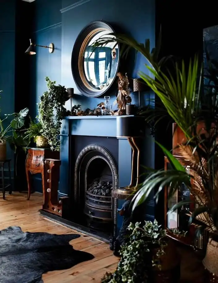
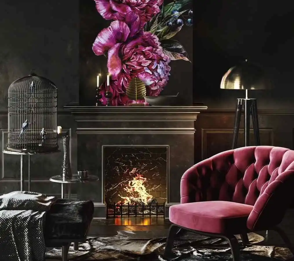
On the other hand, dark colors create a feeling of closeness. The surface appears closer to the person who is observing.
Useful Tip #1
Dark color creates a sense of intimacy. Use in a large room with good lighting.
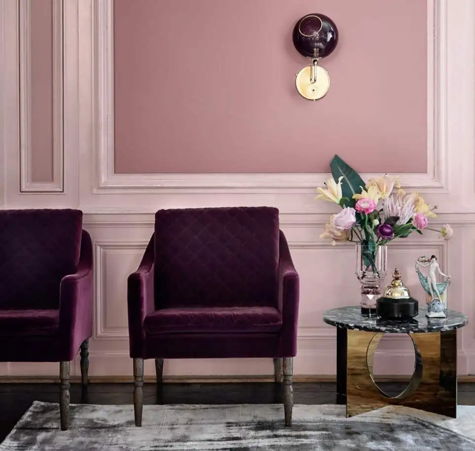
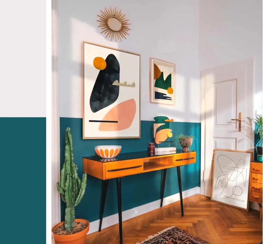
Warm vs Cool
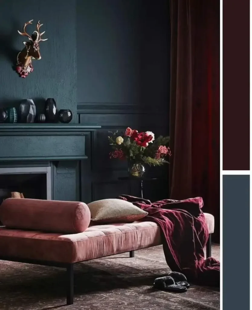
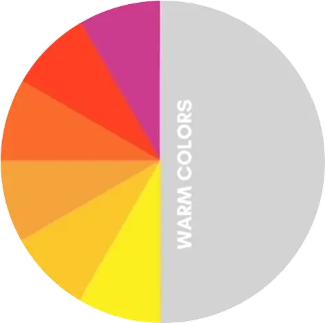
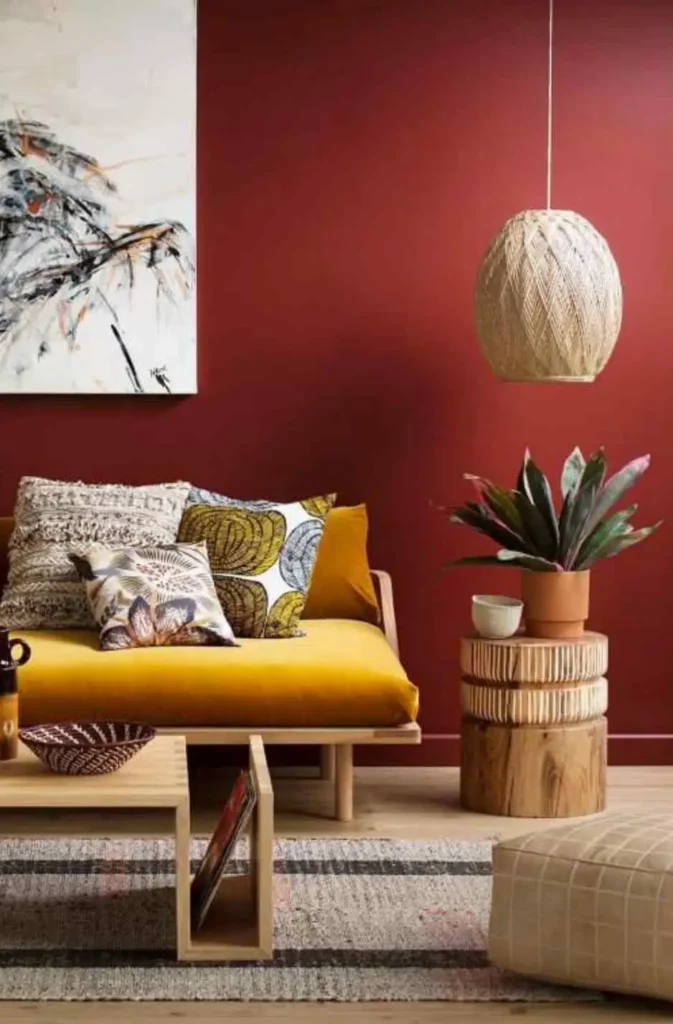
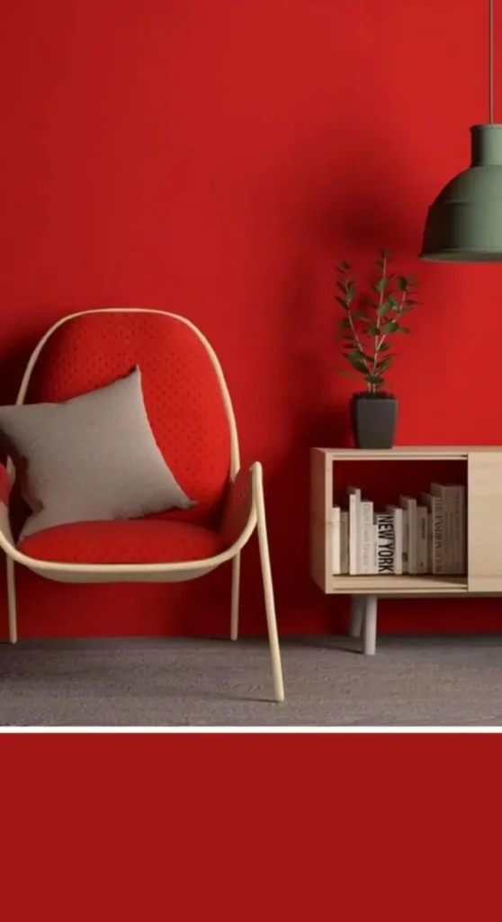
Colors like red, yellow, and orange evoke warmth. They remind us of things like sunset or fire. Warm colors are the ones that attract the most attention.
They give a sense of warmth, and they are strong and cheer you.
Useful Tip #2
Warm colors evoke warmth. Use warm colors to make a big space more intimate and cozy.
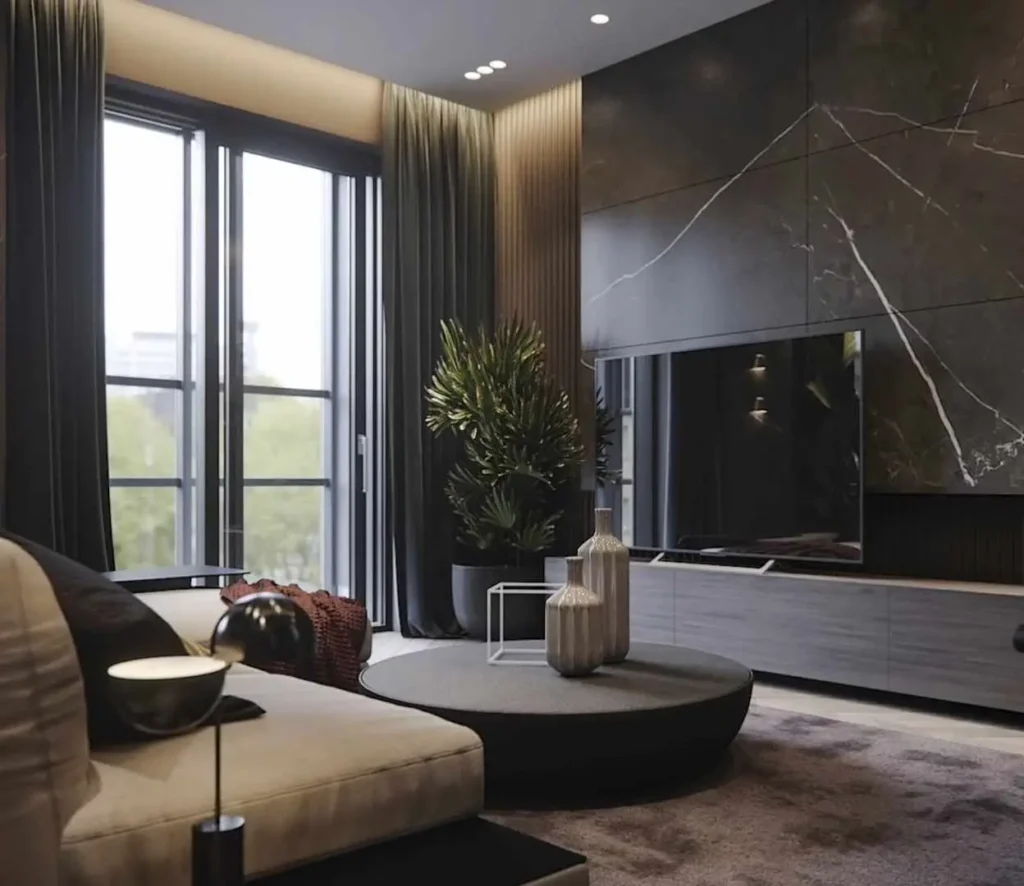
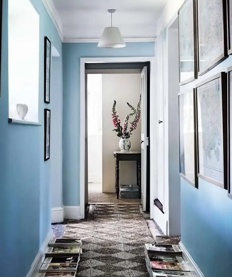
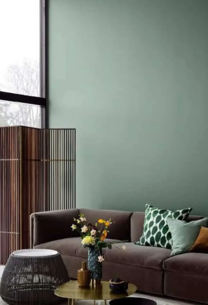
On the other side, the cool colors such as blue, green, and purple.
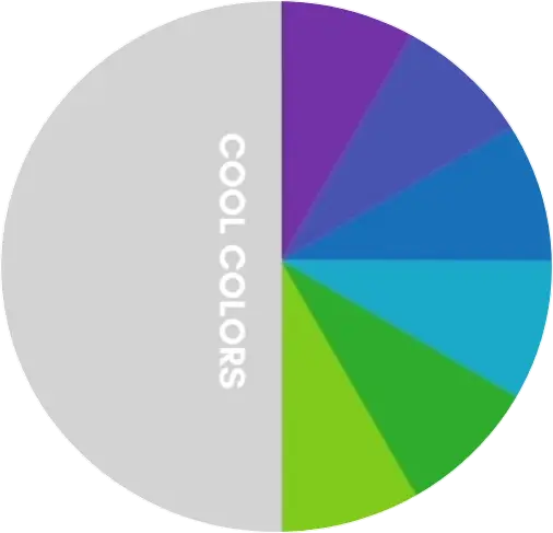
They evoke a cool feeling that reminds us of things like water, the sky, or nature.
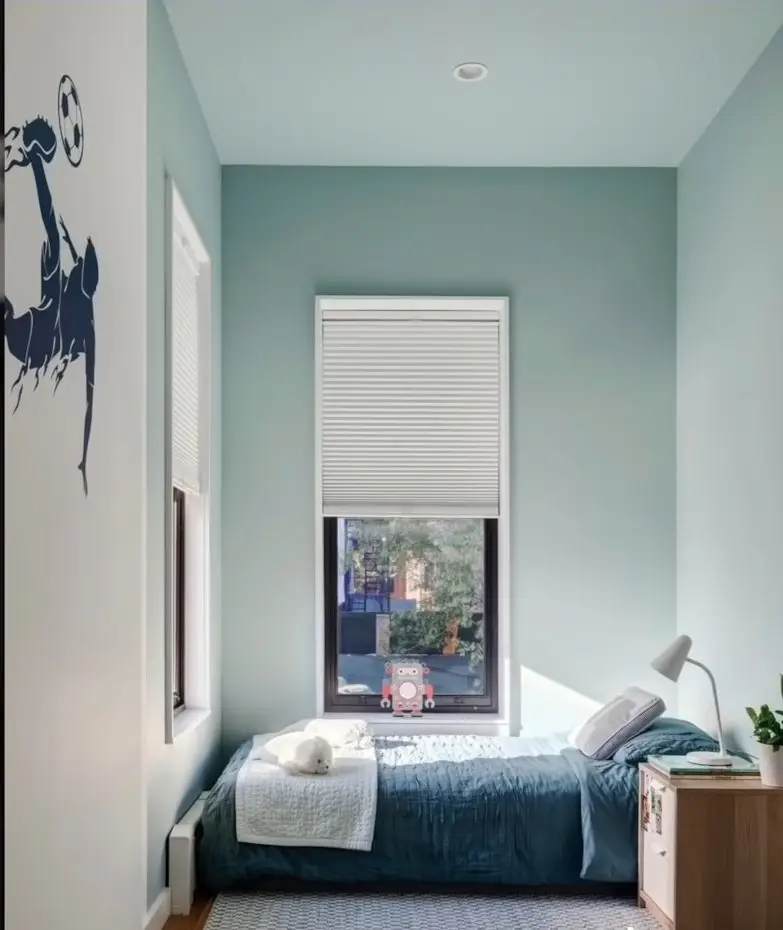
In an interior, cool colors produce a calm, serene, relaxed, and fresh environment.
A small room seems bigger and more spacious because it creates an illusion that the walls are moving away.
Cool colors can be ideal for small spaces such as a bedroom, narrow corridors, or a bathroom. These rooms generally have less space.
Warm colors advance and cool colors recede, affecting the perception of depth.
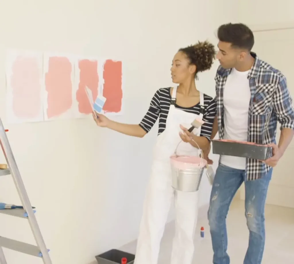
When choosing a color, be clear about the conditions of your space. Consider how you want to fill the space. Choose colors that help with your design goal.
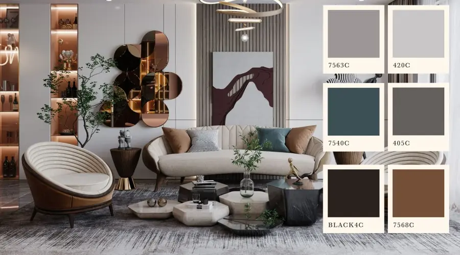
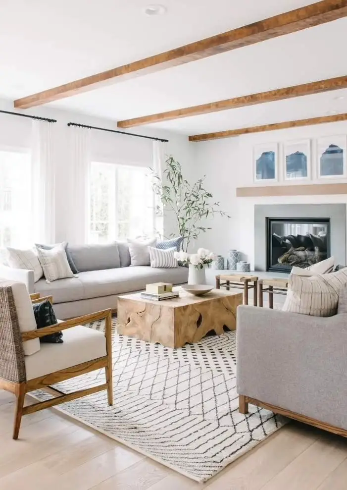
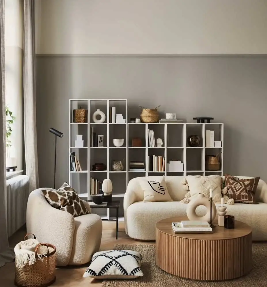
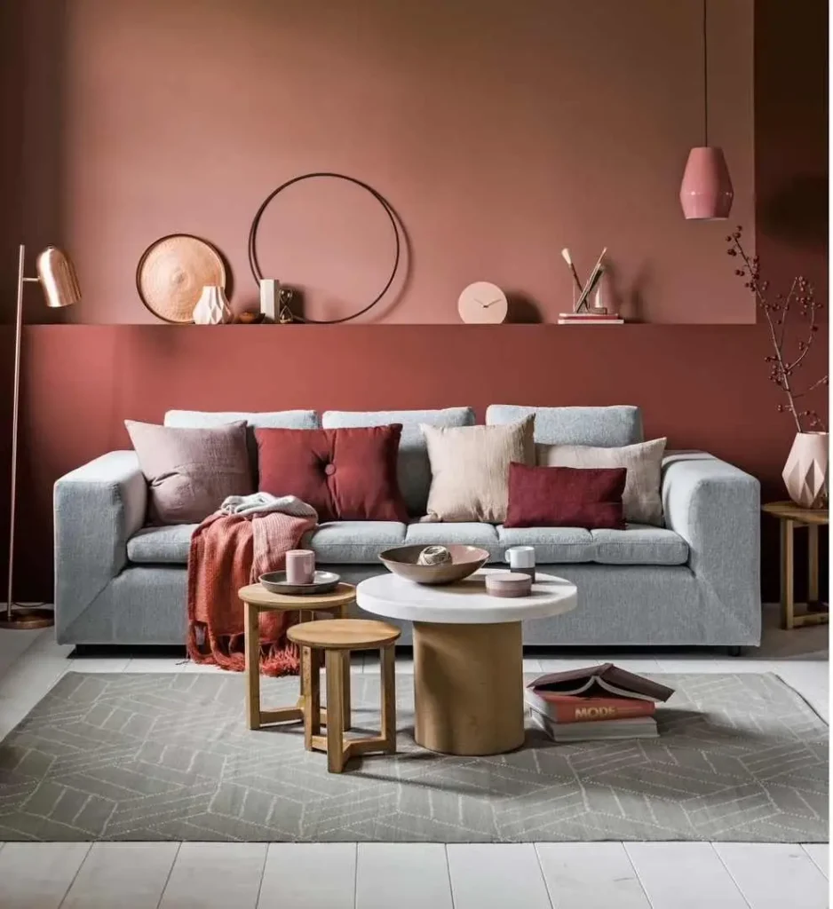
Neutrals
Apart from warm and cool colors. There are the neutrals, if you don’t want to enlarge the space visually, you can opt for neutral colors.
Neutral colors cause dramatic visual sensations because the chromatic content is very low.
Still, you must take into account the undertone when selecting your neutrals because it can ruin your design.
Undertones are the secret code of every near-neutral color. It is the subtle influence of one color under mass tone.
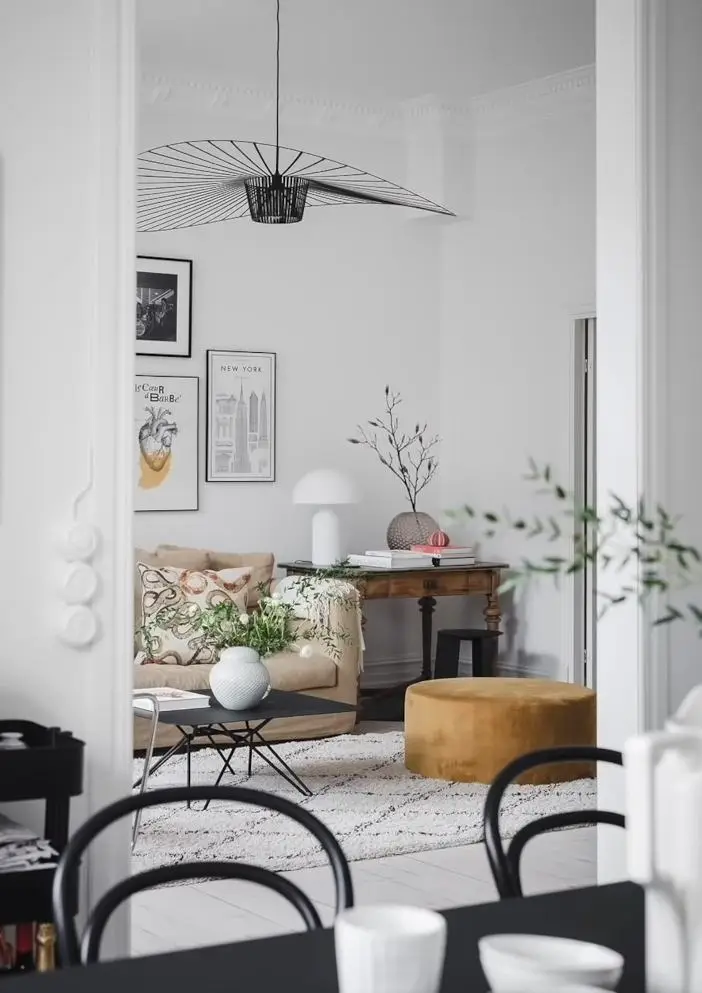
Neutrals are favorites for backdrops in interior design. They work with any style and offer versatility. Neutrals combine well with all colors.
If you want a vibrant hue, start with a neutral paint color.
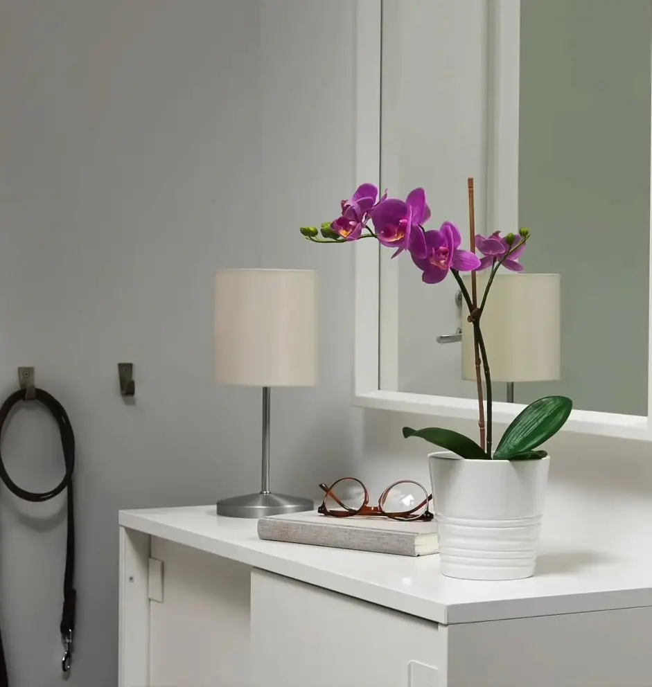
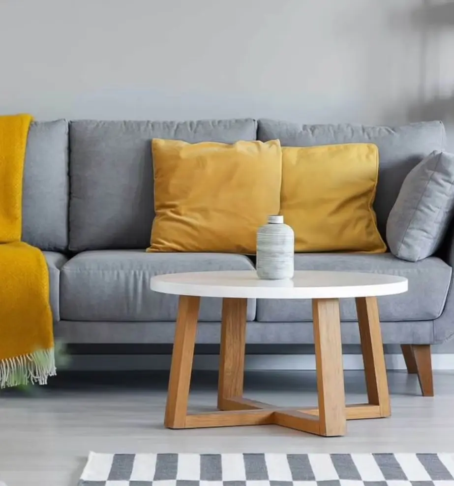
Add pops of color with inexpensive elements like cushions, flowers, and vases. This won’t affect the overall perception of your space.
Colors and Visual Effects
Now you have a precise idea of how warm, cool, and neutral colors affect the perception of spaces.
Let’s see how to get some visual effects like hiding expansion, or how to compact space by using.
It should be noted that all the effects achieved are only visual since the surfaces or objects themselves are not modified.
Maybe you’ll think it’s tricking you, but I’m not; it’s just your mind being tricked by colors and shapes.
Let’s see some examples that you can apply to your spaces…
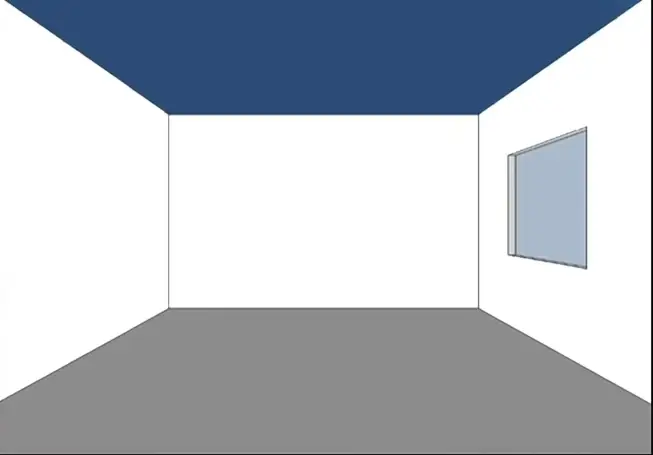
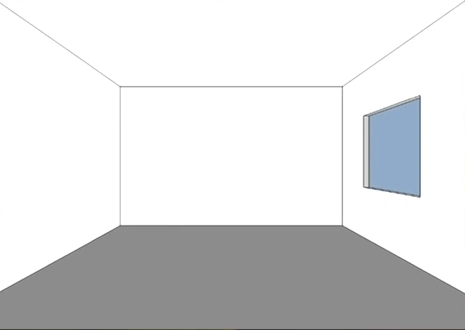
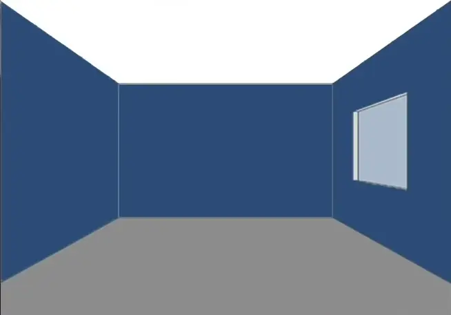
1. Balance Height
If a room has a very low ceiling, raise it, at least visually. We will have to paint it a lighter color than the walls.
If a room has a very low ceiling, raise it, at least visually. We will have to paint it a lighter color than the walls.
On the other hand, if we want to make it lower, paint it in a darker tone and it will give a feeling of closeness.
In some circumstances lowering ceiling height can make the space more pleasant and provide a sense of privacy or shelter.
Useful Tip #3
Lowering the ceiling height with a dark color can make the space more intimate.
See how interesting it was, remember what we learned a few minutes ago, light colors expand spaces, and dark colors create a feeling of closeness.
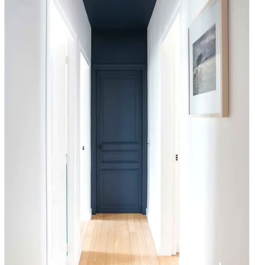
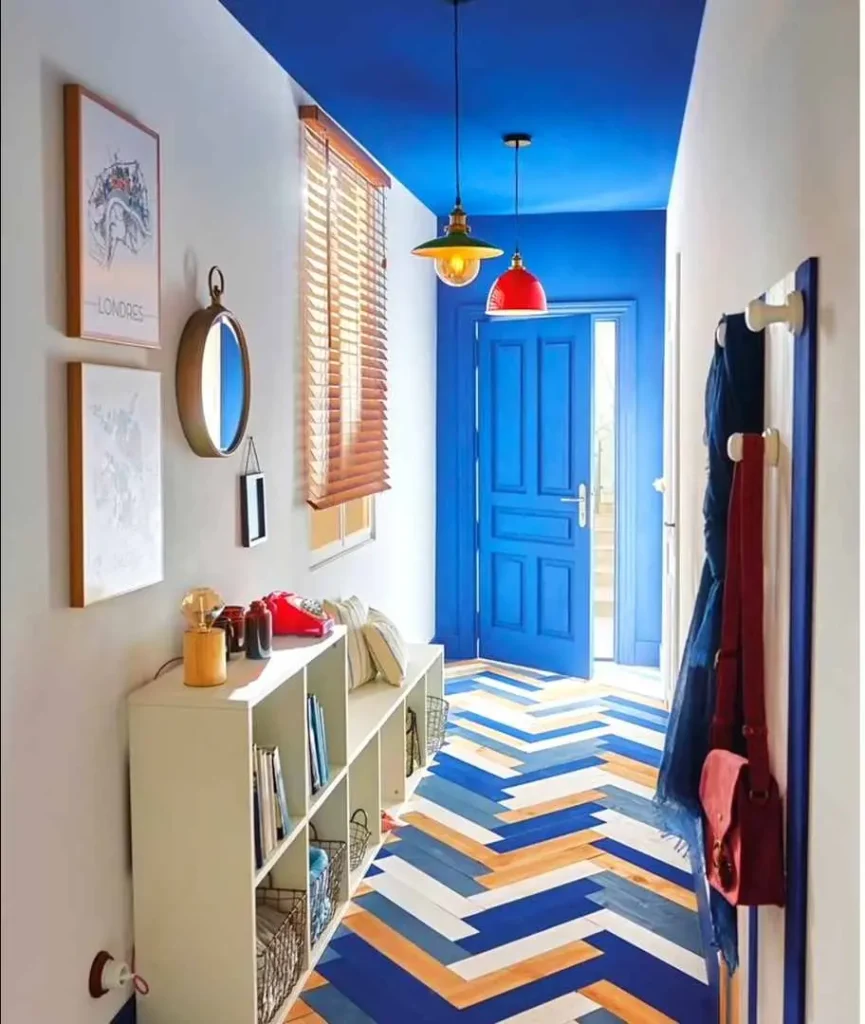
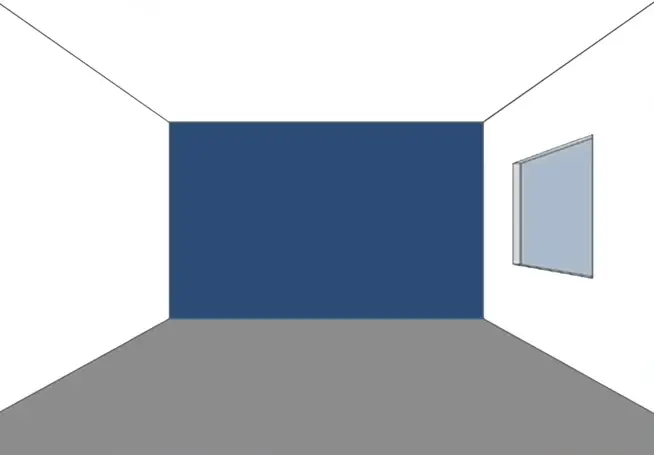
2. Increase The Width
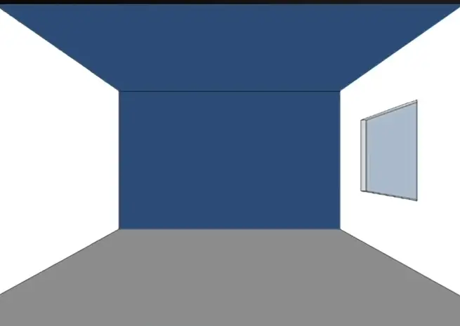
Painting the back wall and ceiling darker while leaving the side walls lighter will make the space more spacious. This is a widely used technique in narrow hallways or rooms.
3. Narrow The Space
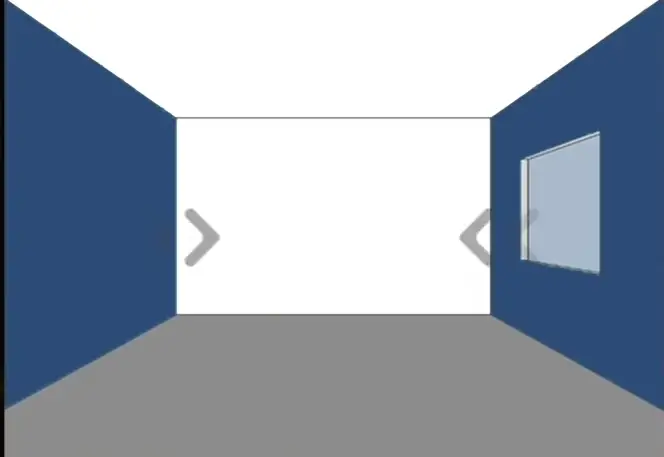
Painting the two opposite walls in dark colors and leaving the background ceiling in light colors will narrow the space for the eyes.
Improving the proportion of rooms with unbalanced dimensions.
4. Shorten The Space
If you have a huge space and want it to feel smaller and more intimate, you should add a dark tone on the back wall and use lighter tones on the other surfaces.

Useful Tip #4
Make a big space cozy with a pop of dark color!
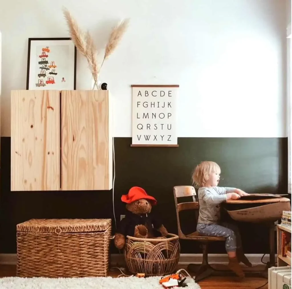
5. Shorten The Walls
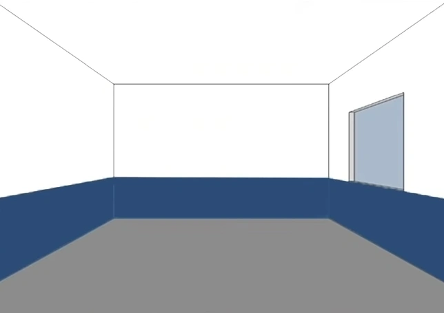
If the idea is to shorten the walls, a dark color should be applied to the bottom.
6. Expand The Space
The small rooms are enlarged if painted in light colors like neutrals or white, since the walls give a receding feeling to accentuate this effect.
It is best to match the color of the walls and ceiling.
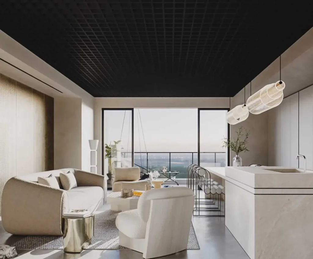
7. Compact the Space
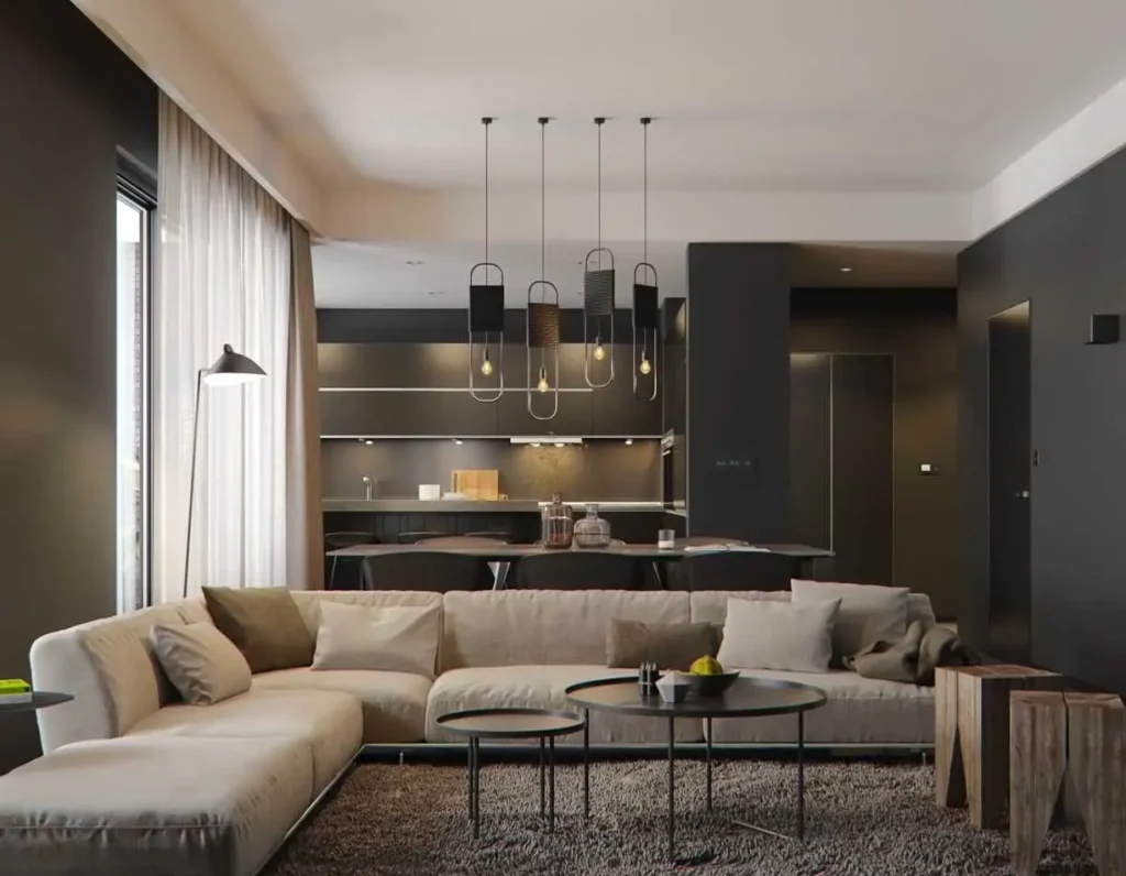
Make the room look smaller and cozy by opting for stronger colors for the wall surfaces that can work well.
As we saw before, dark and warm colors make surfaces seem closer to us a visual effect much needed in big rooms.
Now I’m sharing the professional’s secret of selecting the color that I promised you in the beginning.
1. Choose The Color That You Like
If you design your room by hiring an interior designer, there is are very high chance that the color they use in your room is likely to be influenced by the likes of the professional you hired.
Now, considering the visual effects and emotions that a color provokes is very important.
It’s also important to choose what we like and identify with our personality. Although there are rules and color theories.
You must know how you feel under the stimuli of a certain color, apart from the theory. We must take the individual into account.
2. Think about What You Already Have
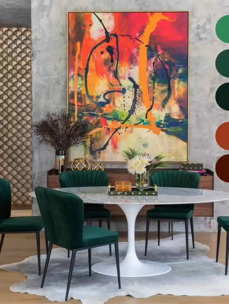
Choose your color, thinking about what you already have.
If you don’t have any idea about what color to paint, a good way to narrow down your choices is to pull a color out of a piece of art or an area rug that’s in the room.
This color could be a good starting point, you can pick a tint, tone, or shade within the same hue or color family, or select a complementary color.
3. Rule: 60-30-10

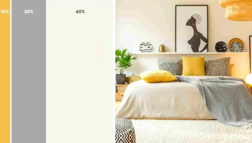
60-30-10 Rule is used to balance color combinations and to create proportion and harmony between all colors.
60% of the room is the main color, which usually includes large furniture, rugs, and walls.
30% of the room is the secondary color, which usually accentuates or is an accent wall, and the remaining 10% is the accent color, which usually includes small pieces such as cushions, artwork, table lamps, and accessories.